Rendering markdown and resizing images with React-Markdown
This post will show you how to render markdown in a React app and automatically resize images in the markdown. It uses TypeScript, react-markdown, and React Hooks.
Markdown with a resizing image inside a React component:
The git repo is here: https://github.com/jacobwicks/markdownreact
Credit to “mrm007” who wrote this post on how to make a custom image renderer for react-markdown: https://github.com/rexxars/react-markdown/issues/384#issuecomment-577917355
Credit to “Marco Antônio” and “Jeffrey Terry” who wrote this stackOverflow answer on how to get the width of a react element https://stackoverflow.com/questions/43817118/how-to-get-the-width-of-a-react-element/59989768#59989768
Starting the new project
- Create a new react app
$ npx create-react-app markdown --template typescript
Navigate to the folder of the new react app you just created
- Install React-Markdown
$npm i react-markdown
Write a markdown file
React-Markdown reads markdown files and lets you easily display them as react components. So let’s write an example markdown file.
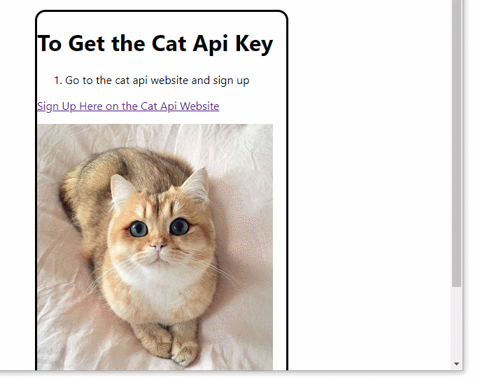
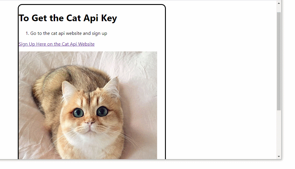
Create a new markdown file src/catInstructions.md. Copy and paste the content below into it. This content has a picture of a cat that is 700 pixels wide.
# To Get the Cat Api Key
1. Go to the cat api website and sign up
<a href="https://thecatapi.com/signup" target="_blank">Sign Up Here on the Cat Api Website</a>

2. You will get an email with the key in it.
3. Copy the key from your email into the field on this page
Rewrite App.tsx
Replace the App component with this container div.
1
2
3
4
5
6
7
8
9
10
11
12
13
14
15
16
blockName: app
function App() {
    return (
        <div
            style={{
                border: 'solid',
                borderRadius: 15,
                marginLeft: 100,
                marginTop: 50,
                width: 500,
            }}
        >
            Hello World
        </div>
    );
}
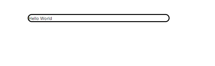
The div has a fixed width of 500. This is narrower than the cat image in the markdown, which is 700 pixels wide.
To run the react app, go to the directory and run “npm start”
$ npm start
The div will look like this:
Change the imports in App.tsx
We are going to use the React useState hook and the useEffect hook, so import those. Also import ReactMarkdown.
1
2
3
blockName: imports1
import React, { useState, useEffect } from 'react';
import ReactMarkdown from 'react-markdown/with-html';
We use HTML in our markdown file, so we are importing ReactMarkdown with the html parser turned on. If we weren’t using HTML we could just import it from ‘react-markdown’.
Write the ExampleMarkdown component
We’re going to create a new component called ExampleMarkdown inside of App.tsx. We’ll put this component above the App component. ExampleMarkdown will load the markdown from the catInstructions.md file that we wrote earlier. ExampleMarkdown will then display the markdown on screen.
1
2
3
4
5
6
7
8
9
10
11
12
13
14
15
16
17
18
19
20
21
22
23
24
25
26
27
blockName: exampleMarkdown
const ExampleMarkdown = () => {
    const [input, setInput] = useState('');

    const getInput = async () => {
        const instructionsPath = require('./catInstructions.md');

        try {
            const instructionsFile = await fetch(instructionsPath);

            const instructionsText = await instructionsFile.text();

            setInput(instructionsText);
        } catch (err) {
            console.error('Problem reading markdown file', err);
        }
    };

    useEffect(() => {
        getInput();
    }, [getInput]);

    return <ReactMarkdown
            escapeHtml={false}
            source={input}
          />;
};
We use the useState hook to hold the input string that the ReactMarkdown component will render.
getInput is an async function. We use the await command to wait for asynchronous operations to complete before using their results for the next step.
This is the relative path of the .md file that we are fetching. In practice, you might be getting the .md file from a different folder, or from an api request.
Wait for fetch to get the contents of the file.
The .text() method of a fetch Response gives us the response as a string. It is asynchronous, so we use the await command to wait for it to finish. The variable instructionsText is a string with the same content as the catInstructions.md file that we wrote earlier.
Set the input equal to the instructionsText string.
This useEffect hook will run once when the component mounts. It will call the getInput function to load the markdown file into the input useState hook. useEffect hooks actually run every time the value of one of its dependencies changes. But the only dependency of this useEffect hook is the function getInput. The value of getInput won’t change, so the hook will only run once.
The ReactMarkdown component parses the markdown and renders it on the screen.
We have HTML in our markdown that we want to render, so we set escapeHtml={false}
The source for the markdown is the value of the input useState hook.
Add ExampleMarkdown to App
1
2
3
4
5
6
7
8
9
10
11
12
13
14
15
16
blockName:
function App() {
    return (
        <div
            style={{
                border: 'solid',
                borderRadius: 15,
                marginLeft: 100,
                marginTop: 50,
                width: 500,
            }}
        >
            <ExampleMarkdown/>
        </div>
    );
}
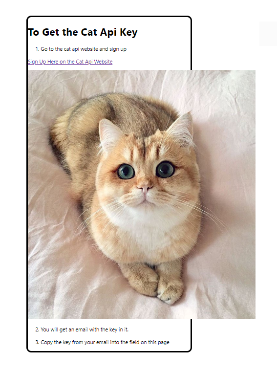
Ok, now it runs. And it’s reading and rendering our markdown file. Great! But oh no! The cat is wider than the div!
How do we fix this?
React-Markdown doesn’t provide a setting for automatically resizing images yet. It might be added sometime in the future. React-Markdown also doesn’t support the normal markdown syntax for limiting image width yet.
Usually in markdown you can limit image dimensions like this:
Limit width to 100 and height to 200

Limit just width to 250

You can't use this syntax in React-Markdown.
But React-Markdown does let you write your own functions to display each type of node that it generates. So we can write our own renderer function for image nodes and pass that to the ReactMarkdown component.
Our custom render function will limit the max width of images. Then when ReactMarkdown finds an image, it will send that image to our function, and the image width will be limited like we want.
Add Custom Renderer to ExampleMarkdown
Write this custom render function inside of the ExampleMarkdown component. Our container div is 500 pixels wide, so we’ll set the max width of the images to be 475 pixels. Pass the renderers object that contains our custom image function to ReactMarkdown.
1
2
3
4
5
6
7
8
9
10
11
12
13
14
15
16
17
18
19
20
21
22
23
24
25
26
27
28
29
blockName: imageRenderer
    //ReactMarkdown accepts custom renderers
    const renderers = {
        //This custom renderer changes how images are rendered
        //we use it to constrain the max width of an image to its container
        image: ({
            alt,
            src,
            title,
        }: {
            alt?: string;
            src?: string;
            title?: string;
        }) => (
            <img
                alt={alt}
                src={src}
                title={title}
                style={{ maxWidth: 475 }}  />
        ),
    };

    return (
        <ReactMarkdown
            escapeHtml={false}
            source={input}
            renderers={renderers}
        />
    );
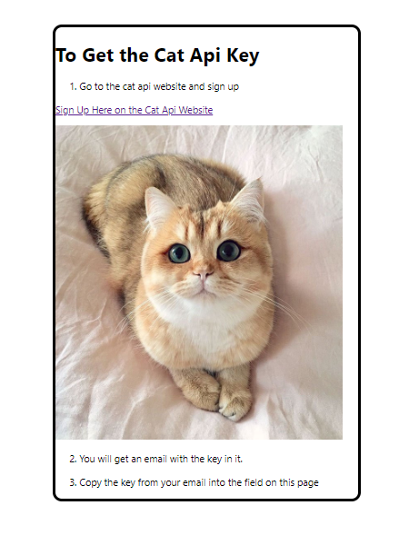
The width of the images is limited to 475 pixels.
Run it, and you’ll see the cat now fits in the box!
That’s great. And it works because we know that the div is 500 pixels wide, so a picture 475 pixels wide will fit. But it’s pretty common to use elements that don’t have a fixed size, and change based on how big the screen is. Would that cause any problems?
Change the Container Div to Resize with The Screen
Change width from 500 pixels to 50 vw. This will make the div width half of the width of the browser window. vw is a CSS unit equal to 1 percent of the width of the viewport.
1
2
3
4
5
6
7
8
9
10
11
12
13
14
15
16
blockName: divWithVw
function App() {
    return (
        <div
            style={{
                border: 'solid',
                borderRadius: 15,
                marginLeft: 100,
                marginTop: 50,
                width: '50vw',
            }}
        >
            <ExampleMarkdown />
        </div>
    );
}
50 vw means 50% of the screen width. This is one of many ways of making elements resize with the screen.
Ok, now the cat still fits. But play with changing the size of the browser window and see what happens.
When you change the size of the browser window the size of the container div will change. But your cat stays the same width! Eventually your div will be too skinny for the cat.

That doesn’t look good. How can we fix this problem?
Find the Width of the Div and Change the Max Width of the Image
Add the React useRef and useCallback hooks to the imports.
useRef gives us a way to generate a ref to our div component. This will let us keep track of when the div changes size. If you are really curious about what a ref is, the React docs explain it here: https://reactjs.org/docs/refs-and-the-dom.html
useCallback wraps a function and makes sure the function only runs if it needs to. When you call functions from inside hooks, you’ll end up using useCallback to stop the hooks from running too often and causing problems.
1
2
3
blockName: imports2
import React, { useCallback, useEffect, useRef, useState } from 'react';
import ReactMarkdown from 'react-markdown/with-html';
Write the useResize function. This function takes a ref as a prop, and returns the width. It also listens for when the window resize event fires and updates the width every time the ref size changes.
1
2
3
4
5
6
7
8
9
10
11
12
13
14
15
16
17
18
19
20
21
22
23
24
blockName: useResize
const useResize = (myRef: React.RefObject<HTMLDivElement>) => {
    const getWidth = useCallback(() => myRef?.current?.offsetWidth, [myRef]);

    const [width, setWidth] = useState<number | undefined>(undefined);

    useEffect(() => {
        const handleResize = () => {
            setWidth(getWidth());
        };

        if (myRef.current) {
            setWidth(getWidth());
        }

        window.addEventListener('resize', handleResize);

        return () => {
            window.removeEventListener('resize', handleResize);
        };
    }, [myRef, getWidth]);

    return width && width > 25 ? width - 25 : width;
};
useResize takes a ref to a div element as a prop. If you reuse this code for another kind of element, you’ll have to change the type of the RefObject.
getWidth returns the width of the current value of the ref.
getWidth looks at the offsetWidth of the element.
The question marks are optional chaining. This lets us try to access properties of an object that may be undefined without throwing an error.
getWidth is wrapped in useCallback. Try removing the useCallback wrapper like this:
const getWidth = () => myRef?.current?.offsetWidth
React will still run it, but will give you an error.
width is either a number or undefined. We use the useState hook to store the value of width. useState returns an array. The brackets are array destructuring.
useEffect hooks will run whenever the value of one of their dependencies changes. This hook will run whenever the value of myRef changes.
We call handleResize whenever the window is resized. We get the current width of the ref, and store the value in width.
The current property of a ref is the element that the ref is pointed at. In our app, the ref starts out as null and then changes to hold the container div. When that change happens, myRef.current is true, and this line will set the starting value of the width. If you comment this out, then your image won’t resize when you first start the app.
Here we attach an eventListener to the window object. Whenever a ‘resize’ event happens, we’ll call the handleResize function.
The return function of a useEffect hook is called when the hook is unmounted. This function just removes the event listener. If you add an event listener to the window and don’t remove it when you are done, the event listener will keep firing even when the component that was using it is gone.
This example app doesn’t have a way to unmount the component that calls the hook, so this is just here to show you how to do it.
The ‘depenencies’ of the useEffect hook. Every variable from outside a useEffect hook is one of its dependencies. You should include those dependencies in the dependency array.
If width is defined and is greater than 25, return width -25. We subtract 25 because we want our images to be smaller than the div, not the same size. If with is undefined or is less than 25, return the value of width unmodified.
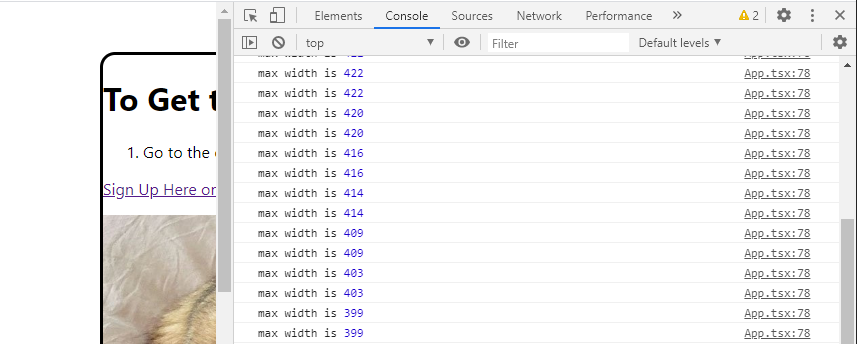
Add a ref to the div. Passing the ref to the useResize function will let us keep track of how wide the div is. In the final step, we’ll pass the maxWidth variable to ExampleMarkdown and use it to set the width of the image. Right now we are just logging maxWidth to the console so you can see it change when you resize the screen.
1
2
3
4
5
6
7
8
9
10
11
12
13
14
15
16
17
18
19
20
21
blockName: addedRefToDiv
function App() {
    const divRef = useRef<HTMLDivElement>(null);
    const maxWidth = useResize(divRef);

    console.log('max width is', maxWidth);
    return (
        <div
            ref={divRef}
             style={{
                border: 'solid',
                borderRadius: 15,
                marginLeft: 100,
                marginTop: 50,
                width: '50vw',
            }}
        >
            <ExampleMarkdown />
        </div>
    );
}
Resize the window and you’ll see that the useResize function returns the updated maxWidth value.
Make the Image Renderer use Variable maxWidth
The last step is to pass the maxWidth into the image renderer function that we wrote earlier.
Make the ExampleMarkdown component take a maxWidth prop.
const ExampleMarkdown = ({ maxWidth }: { maxWidth?: number }) => {And change the image renderer from using a static width of 475
}) => <img alt={alt} src={src} title={title} style={{ maxWidth: 475 }} />,to using the variable maxWidth
}) => <img alt={alt} src={src} title={title} style={{ maxWidth }} />,Finally, change the App to pass maxWidth into ExampleMarkdown.
1
2
3
4
5
6
7
8
9
10
11
12
13
14
15
16
17
18
19
20
blockName: finalApp
function App() {
    const divRef = useRef<HTMLDivElement>(null);
    const maxWidth = useResize(divRef);

    return (
        <div
            ref={divRef}
            style={{
                border: 'solid',
                borderRadius: 15,
                marginLeft: 100,
                marginTop: 50,
                width: '50vw',
            }}
        >
            <ExampleMarkdown maxWidth={maxWidth} />
        </div>
    );
}
Now your image will resize with the container div!